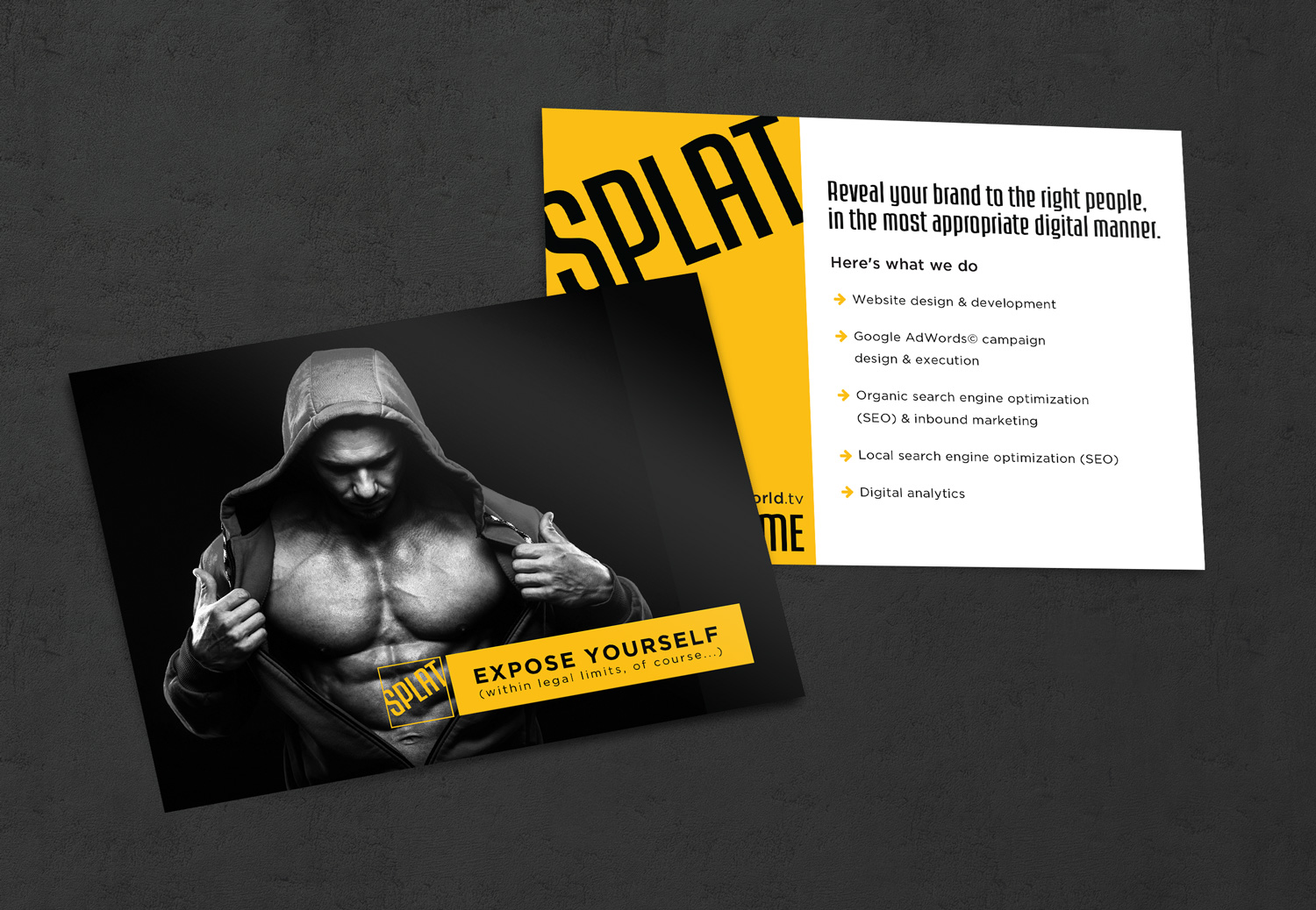
David from Splat World initially approached me asking to simplify his current branding and to give it more of a punch. We decided on using square business cards, since they are not standard, and to create impact using just the black and yellow. Besides the updated branding, a leave behind was requested that was a bit risqué to promote interest
Services
Branding
Landing Page Design
Marketing Materials
Website Design
II. sub-brands
Along with updating the main brand, I was tasked to create two sub-brands for the new podcast David was starting as well as provide a branded blog. Since both avenues involved communication and interacting with other individuals, I combined the new square element of the business cards with a speech bubble to cement their purpose.
III. Website design
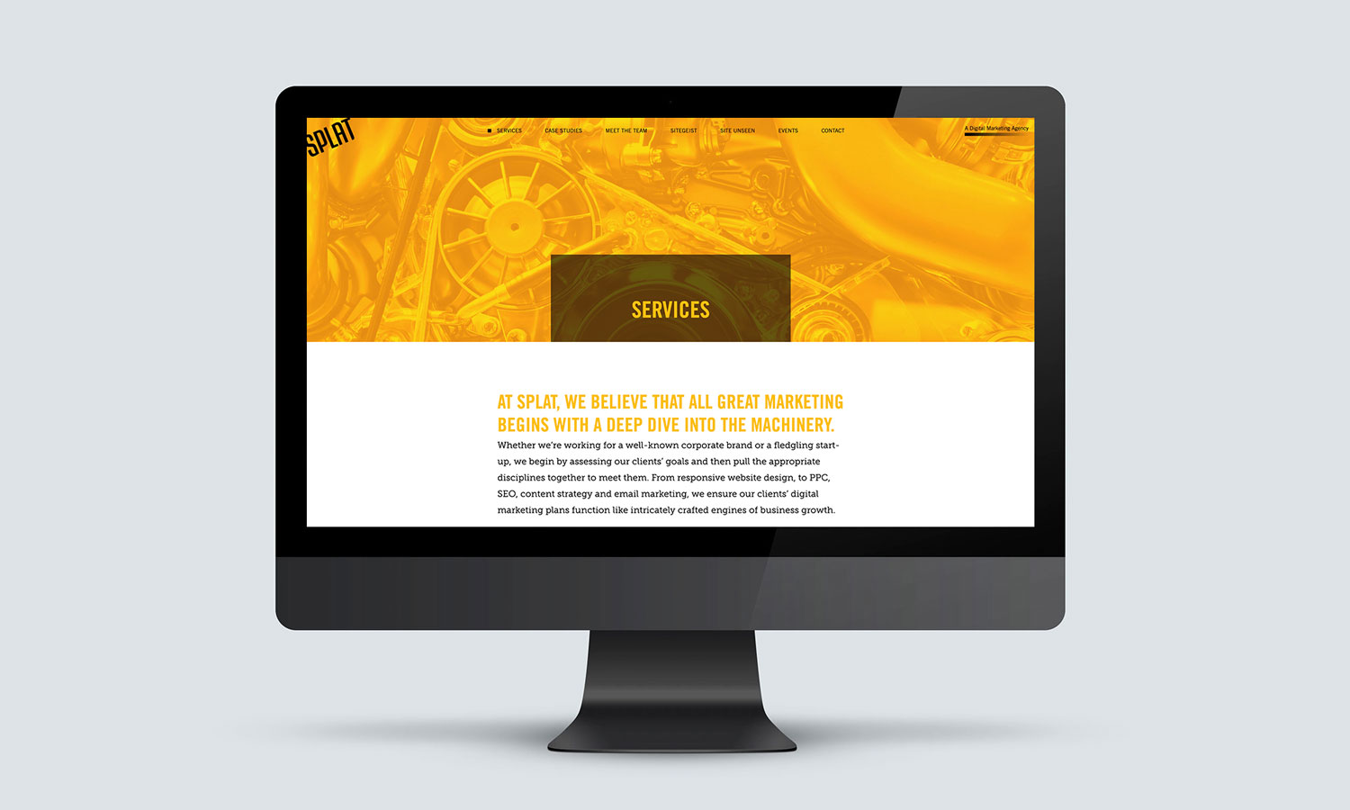
As time passed, we started working on the main Splat website to update it to match the new print materials and new direction the company was going. Originally the site contained more illustrations and had a more fun vibe overall. Since we decided to position the firm to have a more specific target audience (real estate, architecture, and law firms) we gave it a more modern flare. Splat wanted to show its clients that you could have a more modern look and still be refined and appeal to a more conservative client base.
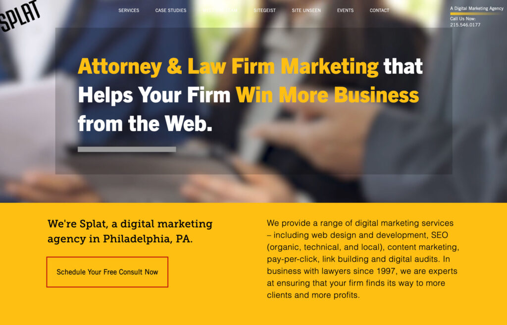
Now that the new direction had been decided upon site wide as well as a clear target audience, I designed targeted landing pages for each market. Each page was to showcase a sampling of specific projects that fit that particular market as well as more tailored service descriptions and statistics.